Writing great popup copy means being specific, benefit-first, and ruthlessly relevant to what your visitor needs at that exact moment. There are five elements to every high-converting popup: headline, subheadline, body copy, CTA button, and micro-copy, and each one has a single job.
Research shows 80% of visitors only ever read the headline — making it the single highest-leverage element in your entire popup. Switching to first-person CTA copy alone lifts conversions by up to 90%, and a 2026 Nielsen Norman Group study across 6,200 participants confirmed first-person CTA phrasing reduces visitor hesitation time by 1.8 seconds per session. Whether you are using a no-code popup builder or a custom-built solution, getting every one of these copy layers right is what separates a 2% popup from a 9%+ one. Here is exactly how to do it.
What you will learn in this guide:
- The 5 anatomy elements every high-converting popup copy needs
- Proven popup headline formulas with real examples
- How to write CTA button text that gets clicked, backed by data
- Psychology principles that make popup copy persuasive without being annoying
- Popup copy examples across every major popup type (good vs bad, side-by-side)
- A pre-publish checklist so nothing is missed before you go live
Why Does Popup Copy Matter More Than Popup Design?
Most people writing their first popup copy spend 80% of their time choosing colors, fonts, and animations. That's understandable — design is visible, tangible, and satisfying to work on. But when it comes to what actually moves your popup conversion rate, copy wins every time.
Here are five data points that settle this:
- First-person CTA copy ("Give Me My Discount") outperforms second-person ("Get Your Discount") by up to 90%, a change of one or two words
- Personalised CTAs convert 202% better than generic ones, according to HubSpot's analysis of 330,000+ calls-to-action
- Popups using numeric discount copy (e.g. "Save 20%") generate 27% more clicks than vague alternatives like "Save big"
- The average popup conversion rate sits at 4.82%, but the top 10% of campaigns regularly achieve 9.28% and above
- A/B tests run across thousands of campaigns consistently show that copy changes move the needle faster than design changes
Think about it this way: design gets your popup noticed. Copy gets it clicked. A beautifully designed popup with weak popup copywriting is like a billboard with nothing written on it; it gets looked at, then ignored. If you only have time to optimise one thing, fix the words first.
What Are the 5 Elements of High-Converting Popup Copy?
Every effective piece of popup copywriting has five layers. Each has a specific job, a maximum word count, and one common mistake that kills conversions if you get it wrong — and most popups get at least two of these wrong before they go live.
| Element |
Job |
Max Length |
Common Mistake |
| Headline |
Hook attention, state the core benefit immediately |
6–12 words |
Vague language ("Welcome Back!") — no benefit stated |
| Subheadline |
Clarify the offer, remove confusion |
1–2 short sentences |
Repeating the headline instead of expanding on it |
| Body Copy |
Explain what they get and why it matters right now |
2–3 lines max |
Writing too much — visitors scan, they don't read |
| CTA Button |
Trigger the click with action + ownership |
2–5 words |
Using "Submit" or "Click Here" — zero value |
| Micro-copy |
Reduce fear, handle the main objection |
1 short line |
Leaving it blank — silence feels risky to the visitor |
Done right vs done wrong:
- Headline ✅ → "Get 20% Off Your First Order — Today Only" | ❌ → "Special Offer Inside"
- CTA ✅ → "Send Me My Discount" | ❌ → "Submit"
- Micro-copy ✅ → "No credit card needed. Unsubscribe anytime." | ❌ → (nothing)
Run every popup you create through this five-element checklist before hitting publish. If any element is vague, missing, or lazy, that is your first fix, not the colour of your button.
How to Write a Popup Headline That Stops Visitors From Clicking Away
Your popup headline is the most important line of copy you will write. Nielsen Norman Group research confirms that 80% of visitors only read headlines and nothing else. That means for most of your audience, the headline is your entire popup.
A strong headline does exactly one thing: it makes the visitor feel that the next line is worth two seconds of their life. It states a specific benefit, outcome, or problem the visitor already has. It does not try to be clever. It tries to be clear.
The 5 Popup Headline Formulas That Consistently Convert
Use these popup headline formulas as your starting point every time. Match the formula to your traffic source and the visitor's mindset on that specific page.
| Formula |
Structure |
Real Example |
| Direct Benefit |
[Verb] + [Specific Result] |
"Get 15% Off Your Entire Order Right Now" |
| Outcome + Timeframe |
[Achieve Goal] + [In X Time] |
"Grow Your Email List by 500 Subscribers in 30 Days" |
| Problem + Solution |
[Name the Pain] + [Offer the Fix] |
"Tired of Low Open Rates? This Free Checklist Fixes That" |
| Question Headline |
[Ask the exact question they're thinking] |
"Want Free Shipping on Every Order?" |
| Objection Preemptive |
[Acknowledge the fear] + [Remove it immediately] |
"No Commitment. No Card. Just 14 Days Free." |
Why these work: Each formula meets the visitor exactly where they are mentally. The Question Headline works for casual browsers. Problem + Solution converts visitors who landed from a pain-point search. Objection Preemptive is gold for SaaS free-trial popups. Choose the formula that matches both your page context and the intent behind your traffic.
Headline Mistakes That Kill Popup Conversion Rates
Even experienced marketers fall into these traps. Here are four popup headline mistakes with corrected versions:
| ❌ Weak Headline |
✅ Fixed Version |
Why It Fails |
| "Hello There!" |
"Get 10% Off Your First Purchase — Limited to Today" |
Greets the visitor instead of giving them a reason to stay |
| "Don't Miss Out" |
"Last 6 Spots Left at This Price — Ends at Midnight" |
Vague urgency — visitors have seen this too many times to care |
| "Subscribe Now" |
"Get Weekly Conversion Tips Straight to Your Inbox" |
Tells them what to do, not what they receive in return |
| "Special Offer" |
"Save 20% on All Orders Over ₹999 — Today Only" |
No specifics, no number, no reason to act now |
How to Write Popup CTA Button Text That Gets Clicked
Your popup CTA, the button text, is the most A/B tested element in all of conversion rate optimisation. A single word change can lift clicks by 90%. The formula is: action verb + specific outcome + first-person ownership.
The A/B test by Michael Aagaard (Unbounce) that switched "Start your free 30-day trial" to "Start my free 30-day trial" increased click-through rate by 90%, that's one word. A 2026 study from Nielsen Norman Group across 6,200 users confirmed first-person popup CTA button text reduces hesitation time by 1.8 seconds per session and drives a 108% lift in completed sign-ups for subscription-based products. The reason it works is the endowment effect, when visitors feel psychological ownership over something before they click, they are far more likely to follow through.
First-Person vs Second-Person CTA: Which Converts Better?
The data is clear. First-person CTA copy for popups consistently outperforms second-person phrasing across industries. Here's the comparison:
| Second-Person CTA |
First-Person CTA |
Conversion Lift |
| "Start Your Free Trial" |
"Start My Free Trial" |
Up to +90% |
| "Get Your Discount" |
"Give Me My Discount" |
+15–45% (typical) |
| "Download Your Guide" |
"Send Me the Guide" |
+20–35% (typical) |
| "Claim Your Offer" |
"I Want This Deal" |
Directionally positive |
| "Sign Up Now" |
"Count Me In" |
Consistently higher |
The mechanism: second-person copy feels like the brand is talking at you. First-person copy makes the visitor feel like they are making the choice themselves. One feels like a command. The other feels like a decision.
CTA Button Copy by Popup Goal
Here is a goal-specific table for popup call to action copy. Use this as your reference every time you build a new popup:
| Popup Goal |
Weak CTA ❌ |
Strong CTA ✅ |
Why It Works |
| Email capture |
"Subscribe" |
"Send Me the Free Tips" |
Names exactly what they receive, first-person |
| Discount offer |
"Apply Coupon" |
"Unlock My 20% Off" |
Ownership framing + specific number |
| Free trial (SaaS) |
"Sign Up" |
"Start My Free 14-Day Trial" |
Timeframe eliminates risk perception |
| Lead magnet / download |
"Download" |
"Get My Free Checklist Now" |
Action + possession + urgency word |
| Cart abandonment |
"Continue Shopping" |
"Save My Cart + Get 10% Off" |
Saves progress AND adds a new incentive |
| Webinar registration |
"Register" |
"Reserve My Free Seat" |
Scarcity framing + ownership |
What Psychology Principles Make Popup Copy Convert Better?
Great popup copywriting isn't manipulation; it's understanding how humans make decisions and writing copy that works with those patterns, not against them. Five psychology principles sit behind almost every piece of high-converting popup copy in the wild.
1. Loss Aversion: "Don't Miss" Beats "Get Now"
Behavioural economics research (Kahneman & Tversky) shows humans feel the pain of losing something 2.5x more intensely than the pleasure of gaining the equivalent thing. That's why "Don't miss your 20% discount" will beat "Get your 20% discount" in many split tests.
- ❌ "Get a free shipping upgrade on your next order"
- ✅ "Don't lose your free shipping, it expires at midnight tonight"
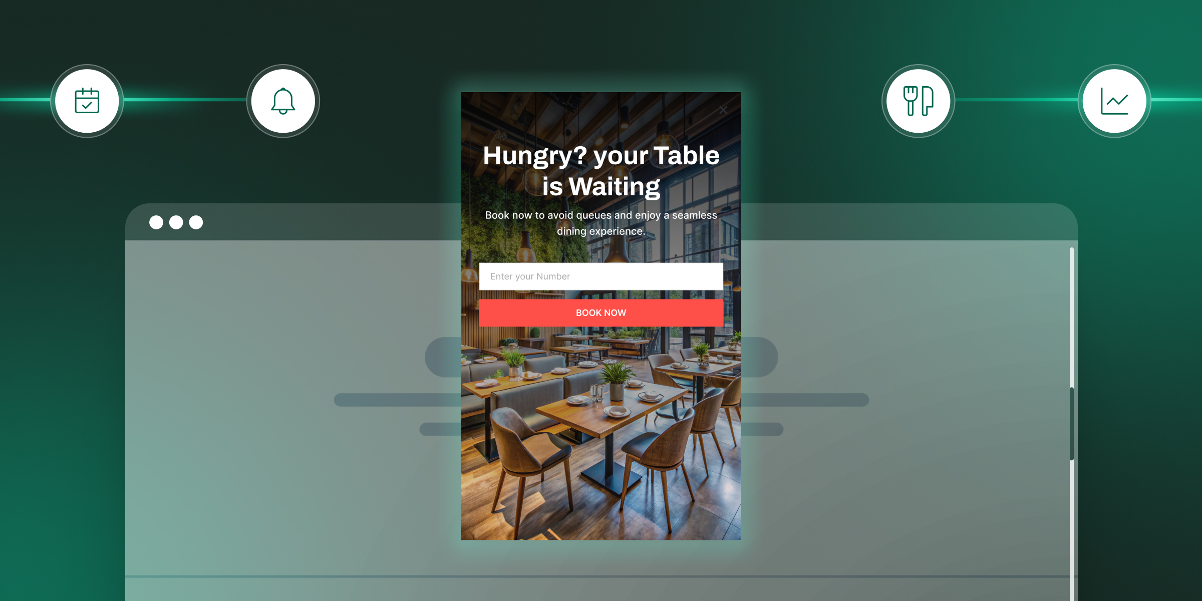
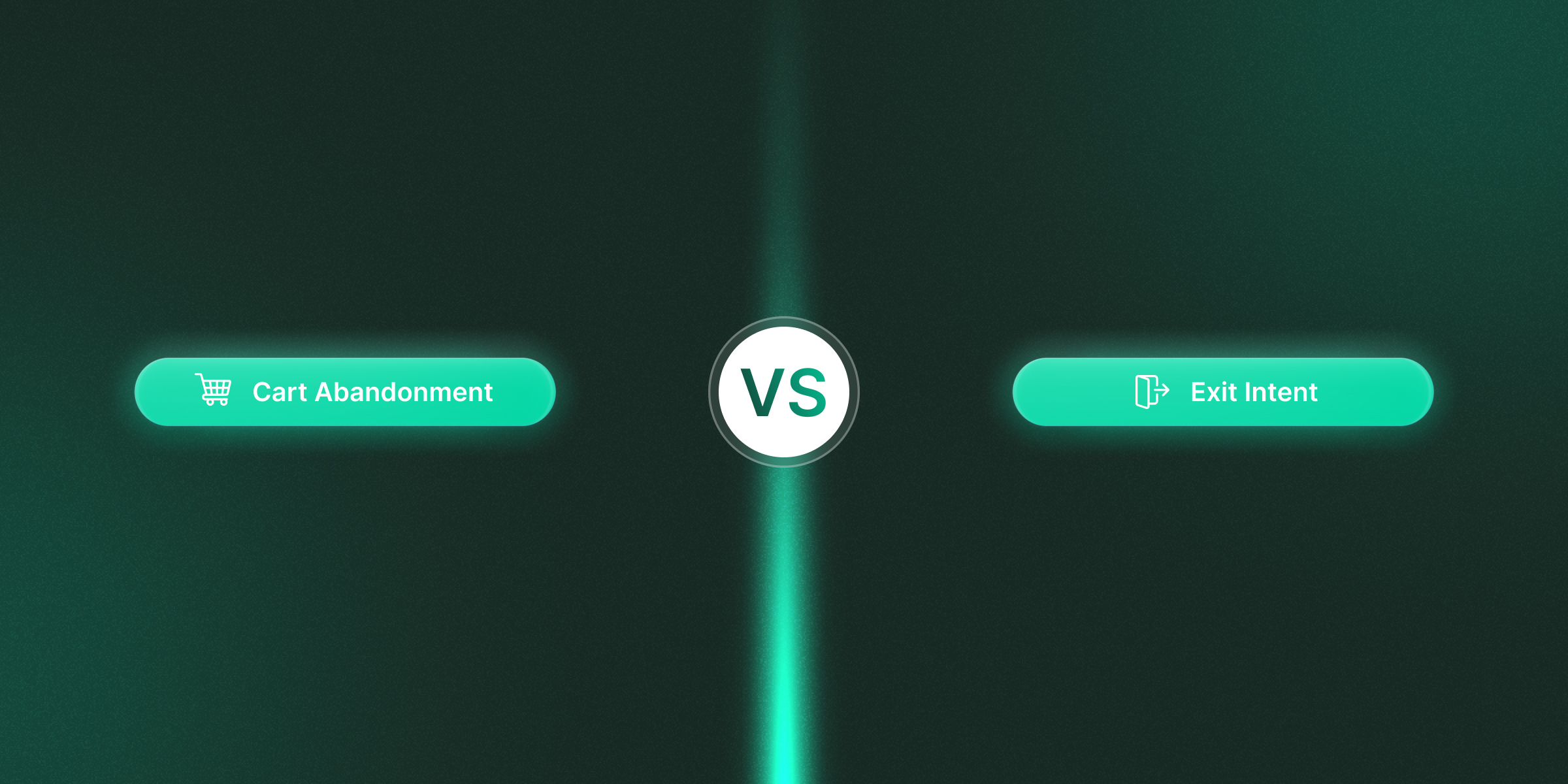
Best use cases: Exit intent popup copy, cart abandonment, time-limited discount popups.
2. Social Proof: Numbers Remove Hesitation
Research by Solomon Asch and later Robert Cialdini confirms that 95% of people look to others before making a decision. Visitors feel safer subscribing, clicking, or buying when they know thousands of others already have.
Adding a line like "Join 14,000+ marketers who read this every week" consistently lifts opt-in rates by 20–32% compared to copy without social proof.
- ❌ "Join our community"
- ✅ "Join 14,000+ eCommerce founders already growing with this newsletter"
Placement tip: Put social proof in the subheadline or micro-copy, directly under your main headline — not buried at the bottom where no one reaches it.
3. Reciprocity: Give First, Then Ask
When you lead with genuine value, a free guide, a checklist, or a discount before asking for the email, conversion rates can jump 2–3x compared to leading with the ask. Robert Cialdini identified reciprocity as one of the six core principles of influence: people feel compelled to return a favour.
- ❌ "Sign up to our newsletter to get updates"
- ✅ "Get our free 30-Day Email Growth Checklist. We'll send it instantly."
The value must be real and specific. "Get updates" is not a value. A 30-Day Checklist with a clear outcome is.
4. Specificity: Specific Always Beats Vague
Vague copy loses trust. Specific copy builds it. Numeric discounts increase popup clicks by 27% compared to vague alternatives. "Download our 50-Point Conversion Checklist" consistently outperforms "Download our Free Guide" in A/B tests because specific numbers make the offer feel researched and trustworthy. Brands with clear, specific messaging see up to 23% higher conversion rates than those with vague copy, across both ads and popups.
- ❌ "Save a lot on your order today."
- ✅ "Save exactly 20%, applied automatically at checkout"
Every place you have written "a lot," "free," "great," or "amazing" in your popup copy, replace it with a number, a name, or a specific outcome.
5. Urgency: Real Deadlines Create Real Action
Genuine urgency converts. Fake urgency destroys trust permanently. Countdown timers attached to real promotions (flash sales, limited stock, event registrations) significantly increase conversions. Countdown timers on evergreen pages that reset every visit get noticed as fake, and when a visitor catches you in a fake deadline, they leave and they don't come back.
Urgency copy formula: [Deadline] + [Consequence of missing it]
- ✅ "Sale ends Sunday at 11:59 PM — after that, full price returns"
- ❌ "Hurry! Limited time offer" (no deadline = no urgency)
How to Write Popup Copy for Different Popup Types
Different popup types fire at different moments in the visitor journey, and the copy must match the visitor's mindset at that exact moment. Most popup templates are built around these exact trigger points, but the design is only half the work. Email popup copy written for a first-time visitor is completely different from exit intent popup copy written for someone about to leave your cart page, and using the wrong copy on the right template is just as costly as having no popup at all.
| Popup Type |
Headline Formula |
CTA Formula |
Micro-copy |
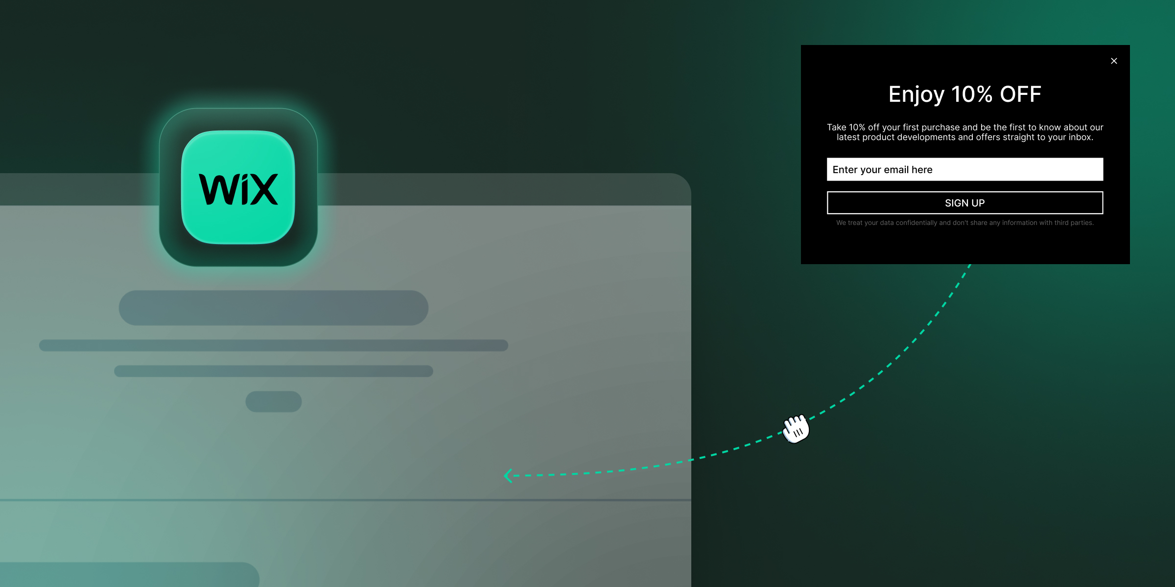
| Welcome Popup |
Direct Benefit — "Get [X]% Off Your First Order" |
"Unlock My Discount" |
"One-time offer. Applied automatically at checkout." |
| Exit Intent Popup |
Problem + Objection — "Wait — Before You Go, Grab 15% Off" |
"Keep My Discount" |
"No obligation. Use it anytime in the next 48 hours." |
| Email Capture Popup |
Outcome + Timeframe — "Get Weekly Tips That Grow Your Store" |
"Send Me the Tips" |
"Join 8,000+ readers. Unsubscribe anytime." |
| Cart Abandonment Popup |
Loss Aversion — "Your Cart Is About to Expire" |
"Save My Cart + Get 10% Off" |
"Discount applied to items already in your cart." |
| Free Trial (SaaS) |
Objection Preemptive — "Try It Free — No Card, No Commitment" |
"Start My Free 14-Day Trial" |
"Cancel in one click. No questions asked." |
| Content Upgrade |
Direct Benefit — "Download the Full 50-Point SEO Checklist" |
"Get My Free Checklist" |
"Instant download. No spam, ever." |
| Discount Popup |
Specificity — "Save 20% on Your Entire Order Right Now" |
"Give Me 20% Off" |
"Discount code sent to your email instantly." |
Popup Copy Examples: Good vs Bad (Side-by-Side)
The fastest way to improve your own popup copy is to see exactly what separates high-converting copy from low-converting copy at a glance. Whether you are just getting started with a popup maker or have been running popups for years, these five real-scenario comparisons will sharpen your instincts fast. Each one shows the bad version, the improved version, and the single change that made the difference.
| Scenario |
❌ Bad Copy (Headline + CTA) |
✅ Good Copy (Headline + CTA) |
What Changed |
| Email capture |
"Subscribe to Our Newsletter" + "Submit" |
"Get Our Free Weekly CRO Tips" + "Send Me the Tips" |
Benefit stated, first-person CTA, no "Submit" |
| eCommerce discount |
"Special Offer — Sign Up" + "Claim Offer" |
"Get 20% Off Your First Order — Today Only" + "Unlock My 20% Off" |
Specific number, urgency, ownership framing |
| SaaS free trial |
"Try Our Tool" + "Start Free Trial" |
"Grow Your Email List — Free for 14 Days" + "Start My Free Trial" |
Outcome named, timeframe added, first-person |
| Exit intent (cart) |
"Don't Leave Yet!" + "Stay" |
"Leave Without Your 15% Off? Here It Is." + "Keep My Discount" |
Loss aversion, specific discount, ownership |
| Content upgrade |
"Download Our Guide" + "Download" |
"Get the 30-Point Checklist: Email List Growth" + "Get My Checklist" |
Specific number, topic named, first-person |
Each of these changes is a five-minute edit. None requires a redesign. All of them target the same psychology: specificity, ownership, and relevance.
Popup Copy Best Practices: Quick-Reference Checklist
Before you set any popup live, run your copy through this 11-point checklist. This covers every popup copy best practices element that separates a 2% popup from a 9%+ popup.
- Headline is 6–12 words and states a specific benefit (not a greeting)
- Headline uses one of the 5 proven formulas (Direct Benefit, Outcome + Timeframe, Problem + Solution, Question, Objection Preemptive)
- No vague words, every "amazing," "great," and "a lot" replaced with numbers and specifics
- CTA button text is 2–5 words, uses an action verb, and is written in first person
- CTA avoids "Submit," "Click Here," and "Sign Up", all have been proven to underperform
- Body copy is 1–3 lines max, readable in under 5 seconds by a distracted visitor
- Micro-copy is present and answers the visitor's most likely objection (cost, spam, commitment)
- Decline button text is neutral and respectful, no guilt-tripping language
- Urgency is real, not manufactured, if there is a deadline, it is a real one
- Social proof is included if you have the numbers, subscriber count, customer count, or a short trust signal
- Copy matches the popup trigger, exit intent copy addresses leaving, cart abandonment copy addresses the cart, welcome popup copy addresses first-time visitors
Recommended To Read: Popup Design Best Practices: UI, UX & Psychology for Higher Conversions 2026
Write Better Popup Copy Starting Today
Popup copy is not about being pushy; it's about being precise. Every word in your popup is either earning a click or costing you one. The brands that consistently hit popup conversion rates above 9% are not running flashier animations or more aggressive triggers. They are running clearer, more specific, more human copy that meets the visitor at exactly the right moment with exactly the right message.
Start with your headline. Make it specific. Move to your CTA. Make it first-person. Add micro-copy. Remove the silence. Then test, because the data for your audience will always be more accurate than any best practice. Use SuperPopups to build, launch, and A/B test your popup copy variants, no code required, free plan available, and your first campaign can be live in under 10 minutes. The best popup copywriting isn't the one you think will work, it's the one your data confirms actually does.
FAQs
1) What is popup copy?
Popup copy is the written text inside a popup window, including the headline, subheadline, body copy, CTA button text, and micro-copy. Effective popup copy is specific, benefit-first, and written for the visitor's context at the exact moment the popup appears. It is the primary driver of popup conversion rate, above design, colour, or animation.
2) How long should popup copy be?
Keep popup copy short enough to read in under 5 seconds. The headline should be 6–12 words. Body copy should be 1–2 sentences maximum. CTA button text should be 2–5 words. Micro-copy is one line. Visitors are in the middle of doing something else when your popup fires; every extra word is a reason to close it.
3) Does first-person CTA copy really convert better?
Yes, consistently. Research cited by Nielsen Norman Group shows first-person CTA copy lifts conversions by up to 90% over second-person equivalents. HubSpot's analysis of 330,000+ CTAs found personalised CTAs convert 202% better than generic ones. The mechanism is the endowment effect; first-person language creates psychological ownership before the click happens.
4) What should I write on a popup CTA button?
Follow this formula: action verb + specific outcome + first-person ownership. Examples: "Give Me My Discount," "Start My Free Trial," "Send Me the Checklist." Avoid "Submit," "Click Here," "Sign Up," and "Register", all of which are passive, vague, and tested to underperform against benefit-specific alternatives.
5) How do I write popup copy for exit intent popups?
Match your exit intent popup copy to the specific reason a visitor might be leaving that page. On a pricing page, they are likely hesitating on price; address that directly. On a product page, they may need social proof. On a checkout page, they may need reassurance about returns.
- ❌ "Wait! Don't Go!"
- ✅ "Not sure yet? Here's 15% off to help you decide, expires in 30 minutes."
6) Should I use urgency in popup copy?
Yes, but only when the urgency is real. Countdown timers on genuine flash sales, limited-stock situations, or event registrations with real deadlines convert well. Fake evergreen timers that reset on refresh are now widely recognised by visitors, and when they are spotted, they destroy trust in your brand. Use urgency honestly, and it works. Manufacture it, and it backfires.
7) What is the best tool to write and test popup copy?
SuperPopups is built exactly for this. It is a no-code popup builder with a built-in A/B testing engine, an analytics dashboard that tracks conversion rate per variant, a free plan to get started, and a setup time of under 10 minutes. You can write, test, and iterate on your popup copy without touching a single line of code, and the analytics show you exactly which version wins.


.jpg)


.jpg)


.jpg)


.jpg)

.jpg)
.jpg)


.jpg)